


When A Picture Paints 1000 Words
And the pictures aren't worth much and there are too many words

There’s nothing wrong with photography and graphics in corporate reports. Unless they divert attention from the real issues. Then there is something very wrong.
I’ll illustrate three ways this happens, and how to avoid all three.
The first way is using images that are not representative of reality. They may even suggest the opposite of what’s going on. I call this using “unreal photos”.
The second way is using a confusing blend of images, graphs, and tables that obscure the truth. I call this “pretend visualizations.”
The third way is a twist on the second: not using images, while burying important data in overly dense, complex text, when an image or graphic would catch the reader’s eye and explain better. I call this “under-imaging”.
The fix for all three is simple:
Use only real photos from your operations, with captions your employees would believe and respect.
Illustrate difficult truths in a visible, comparable format even (especially) if the information is jarring.
These fixes take commitment and humility. They are also necessary if companies wish to inform better decisions that work in service of life.
By the way, I don’t mean humility in “tone”, or better design and layout. I mean an expression of senior-level awareness of serious gaps, even continued failure, on important issues. There is more to say on what is to be done about the gaps and failures. Today I’ll focus on imagery and visuals because without the basics in place we won’t get far on the path to industrial healing.
“Unreal photos” are not reality
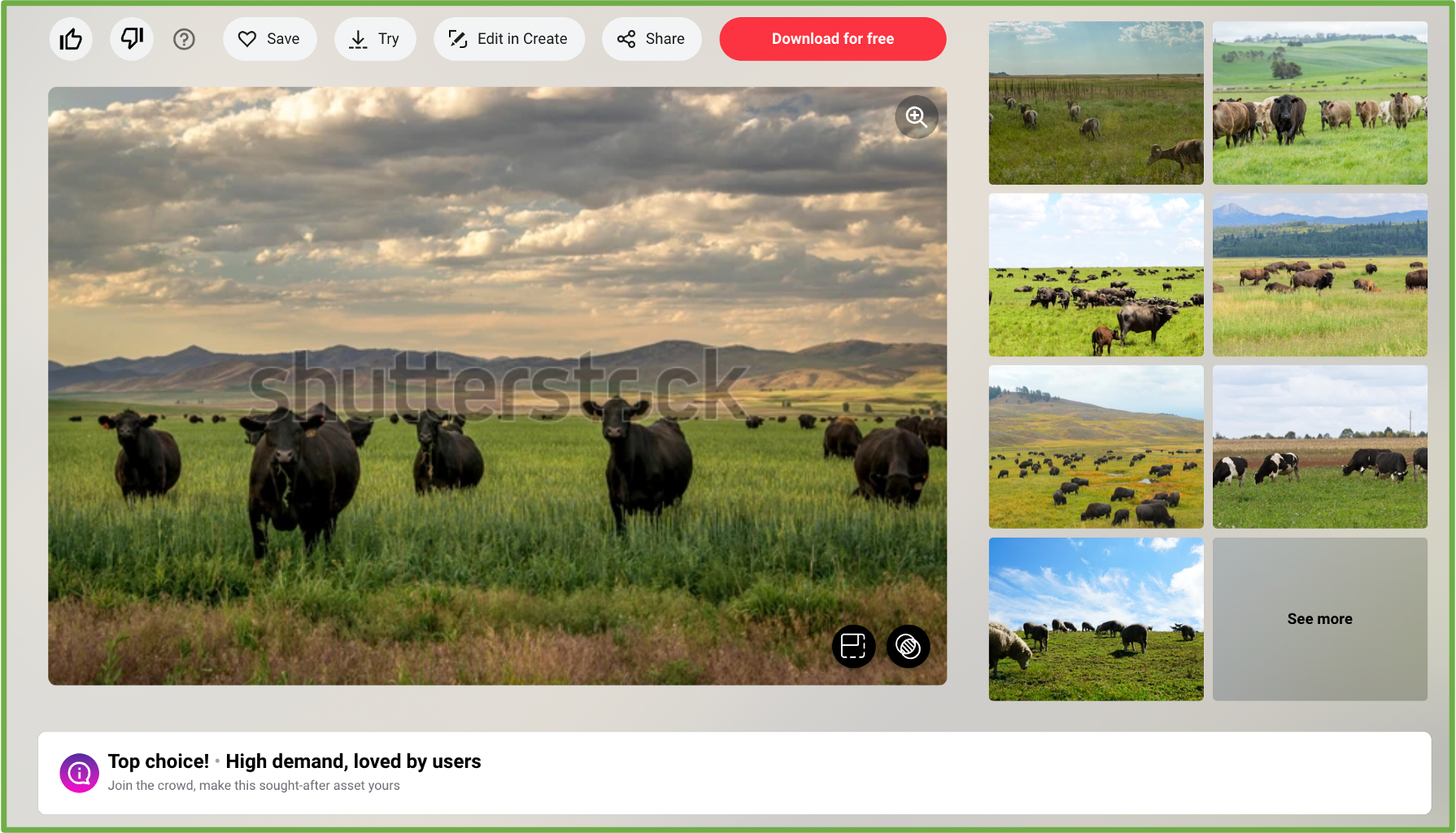
It’s no secret that a lot of companies use stock images in their reports, even though a quick google of “local photographer near me” will serve up a plethora of qualified, available people who could take real photos at a reasonable fee.
The problem with stock images is that they don’t show us the actual company, and they often gloss over important information or even suggest things that are untrue. I wrote about this in detail (in The Easiest Way to Avoid Greenwash?) explaining the problem with an uncaptioned stock image of cattle grazing when a “material” issue of Brazilian meat company JBS pertains to the impact of cattle on the landscape. As I said in that article:
I realize there is a time and place for stock imagery. But that time and place is not where your most critical stakeholders have their most critical things to say about you.
The image appears on JBS USA’s sustainability website, although it is a “high-demand” stock image from Shutterstock (see banner image of this post).

This is not the company’s reality. It doesn’t belong in their sustainability communications and disclosures.
Photos need to be real, and they need captions to back them up. Otherwise they are unhelpful décor at best, misleading greenwash at worst.
“Pretend visualizations” are problematic
Pretend visualizations are especially pernicious because a reader scrolling through a report will see lots of visuals that appear realistic and detailed, suggesting a fairly high degree of transparency.
It’s only when we look closely and ask ourselves what these visuals are telling us that the problematic story emerges.
For example, based on the photos and graphics in the “Our People” section of JBS’s 2021 Sustainability Report, it appears that they have fairly diverse workforce representation and robust data to back it up.

But what do these images and graphics tell us? I flipped back a few dozen pages to the introductory section, where the Board of Directors is shown on page 7—

—then toggled back to the people section where there is a table on page 92 with data on “Percentage Management by Race”.
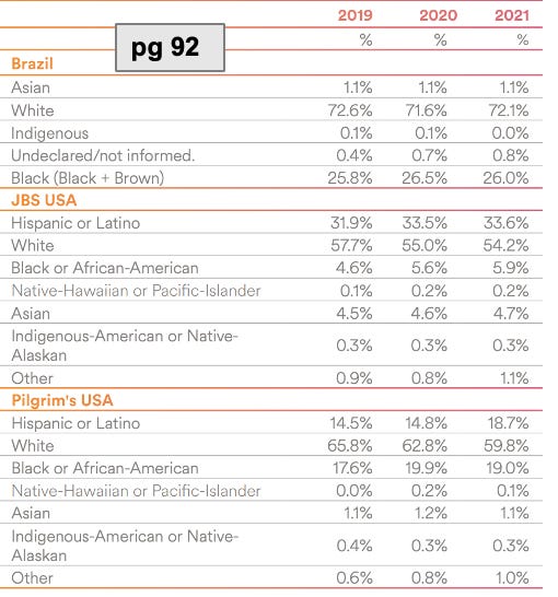
Something didn’t feel fully illustrated, so I made my own chart.

You don’t need a degree in stats to see a picture forming with my simple bar graph: the global management (based in Brazil) are predominantly white; in the US, with about 100,000 non-management employees, the vast majority of workers (e.g. slaughtering, butchering, and processing meat) are non-white.
Here’s another look at those images:

—and the data visualizations:

It’s striking how the images are 80 pages apart. It’s also striking how some data is represented in colourful pie charts, while other data is in a table where it’s a lot harder to get the picture.
To address “pretend visualizations”, relevant photos need to be closer together, and data formatting needs to lend itself to easy comparability. It would also help to include more transparent text beyond platitudes such as, “As ours is a labor-intense industry, we have a global employee management policy based on adherence to the organization’s culture and its business mission.”
Otherwise it’s just pretending everything is fine (look at the smiles! and the colourful pie charts!) when it’s clearly not. Much of the work is grueling, soul-crushing labour. It’s not random that black and brown people are in these low-wage roles while affluent white people make the decisions and collect the higher paycheques.
Pretend visualizations don’t change reality. Management awareness of the history and present of systemic harm embedded in the industry, with plans and actions to change for the better, are what change reality.
“Under-imaging”—where one image could paint 11,000 words
The fifth and final Matereality assessment I undertook was of global mining company Glencore. I haven’t said as much about this one—I’ll dig into it a little more at some point. But to illustrate the importance of illustrating, I’ll include another glaring example for consideration.
There is growing pressure for companies to disclose more details on executive pay. Yet in spite of 17 text-heavy pages and more than 11,000 words on the topic in Glencore’s 2022 Annual Report, we don’t get a clear picture of what’s happening. It feels like a lot of footnotes, or a lengthy box-checking exercise to satisfy a compliance officer.
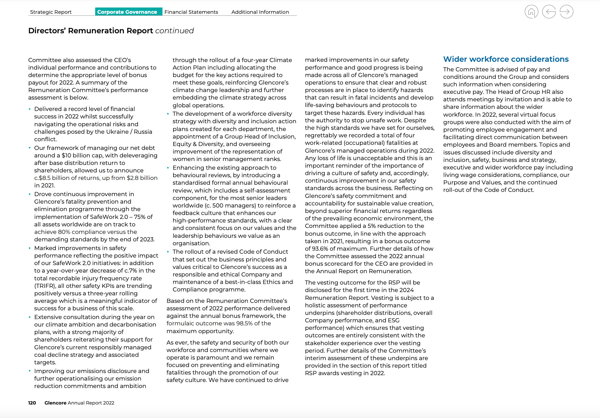
Upon closer reading, the story becomes clear. It goes something like this: in spite of all the verbiage about what the company is tracking on executive pay, most of the people who create the value of Glencore earn a pittance compared to the CEO, and there isn’t any evidence of this changing.
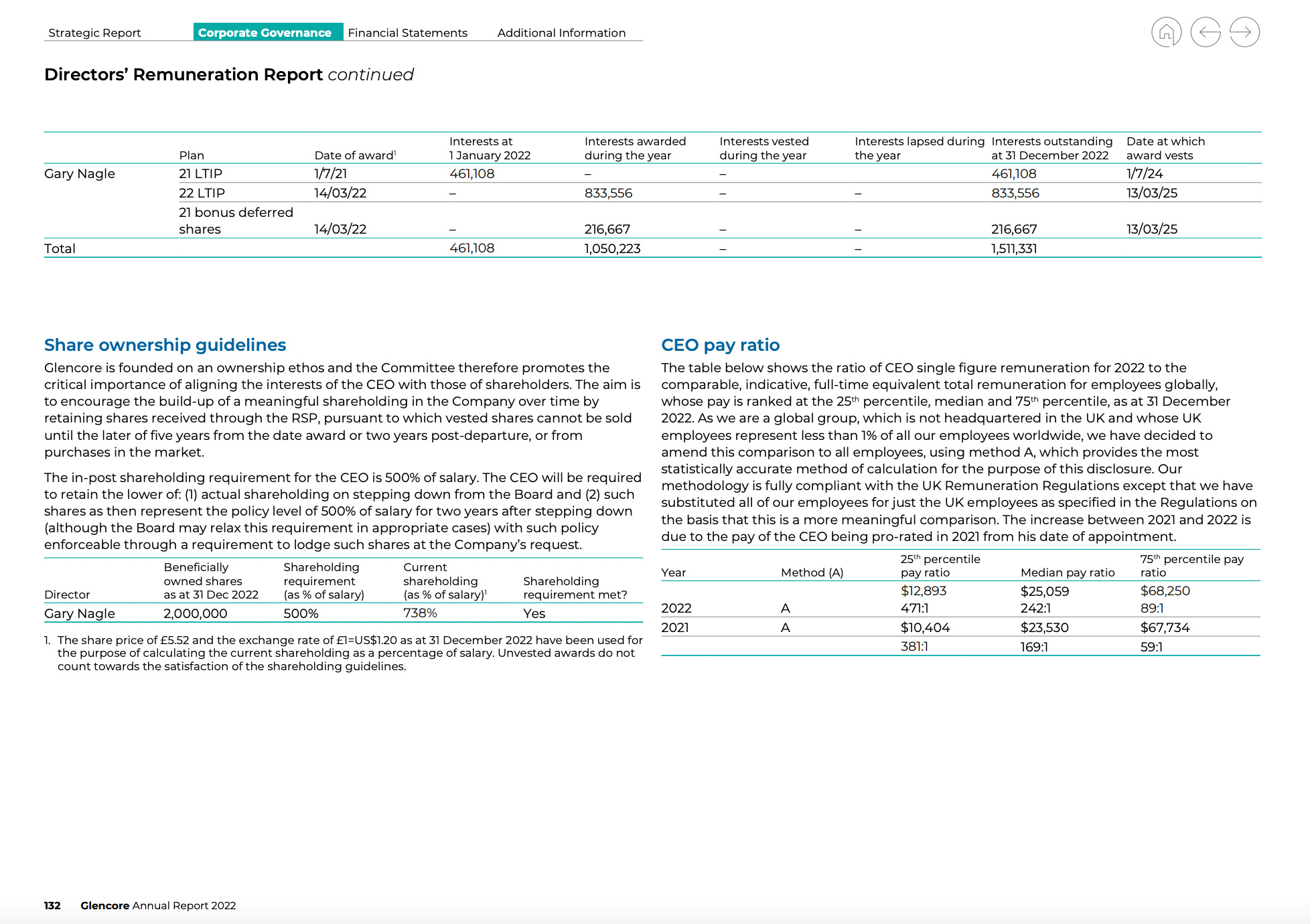
I created my own basic diagram to be able to stand back and better understand the numbers at a glance. A visualization (circles are to scale) makes it abundantly clear that the majority of employee salaries are not even a quarter of the withheld portion of the multi-million dollar bonus (withheld as result of four of their colleagues dying on the job).

Glencore considers Diversity, Equity & Inclusion one of its “material issues” as outlined in their 2022 annual report. Yet 11,000 words of disclosures around pay are not very accessible to the 140,000 employees and contractors who create the products and services of the company, nor do they suggest ways the company plans to change course towards actual equity.

A simple illustration could make 17 text-dense pages more digestible. From there, the company needs to offer clarity on how they will close the gap—or at least be honest about the fact that their business model only works if that gap persists (or worsens).
In sum: illustrate reality and get real
What’s the lesson? Show and tell your company’s real story. Honestly explain and illustrate the consequences of profiting from the people who do the work, and from the biosphere that makes the business possible.
And then either tell us what you’re changing so that you can enable life to thrive, or be clear that you have no viable plans to do so.
This way investors, employees, customers, and consumers can make well-informed choices about engaging with the company. And members of the board of directors can see what impacts the company has, and where to intervene.
Bonus Track
I discuss some of these visual glitches in corporate disclosures with Geoff Kendall, founder the Future-Fit Business Benchmark and the Transition Agency. Around the 11-minute mark of the video below, we look at different ways the same data could be illustrated better, providing more details on the recommendations raised above.
Do you know of examples where a company’s visuals are helping see the true picture and inform decisions? Please share in the comments—I’d love to have a look! Other Matereality ideas and questions welcomed, too.
Know someone working to make the shift towards industrial healing, who might benefit from hanging around in the Matereal World?
You probably get the picture by now: Matereal World is currently free! If you’d like to subscribe, here’s a simply illustrated subscription button for your convenience.
Love this clear explanation of what it would look like to give an accurate representation of companies' activities. Companies always say that they just produce what consumers want. If consumers and shareholders saw images of what's really happening instead of misleading stock photos, they could demand change - ie, they could create a market for something different, in which case industrial healing could become possible or even profitable. If consumers and shareholders didn't demand change after seeing true images, then companies could continue as they are without all the time and energy spent obfuscating the truth. Telling the truth is a win win situation - it just takes someone bold to step up and do it. I love the path you are showing about how to proceed.
As an independent artist, I am often dismayed by the seemingly alternate realities of artists and , well the other world. I find it amazing how you straddle both so elegantly and creatively Lorraine!